Markdown HUD for Notational Velocity

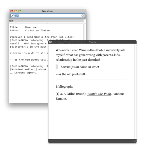
This picture shows my favorite style of previewing notes with MultiMarkdown in Notational Velocity: in a separate tool window which floats on top. I chose this so-called HUD design (“heads-up display”, like a display made of glass in aircrafts) which most of you will already be familiar with by using Apple’s Quick Look.
The preview window is invoked by pressing ⌘⌃P (Cmd-Ctrl-P) or by using the new Preview menu. There, you’ll be able to switch between three currently supported rendering modes: Textile, classic Markdown and MultiMarkdown. But now, these menu items are dysfunctional.
Another idea to make the preview less obstrusive is using a drawer which slides out of NV’s main window. Since implementing this new visual representation was so unbelievably easy (remember I’m new to Mac development), changing it again should not be too much of a problem.
What do you think? Any suggestions? Mail me or reply in twitter! (@ctietze)