Prototypes for Calendar Paste
When Marko (@markowenzel) and I started to plan our first iPhone app codename “ShiftCal”, we met and used prototypes to get a feeling for the Interface we wished Apple provided built into Calendar.app. The prototypes for the app which later would be dubbed “Calendar Paste” were really fun to make.
I can only recommend: if you’re going to create your own iPhone app, don’t just dive into Xcode and Interface Builder. When you use these programmer’s tools for the first time, getting to know their components and technical hurdles will hinder your flow.
You won’t have these issues with paper (prototypes).
Phase 1: Paper Prototype

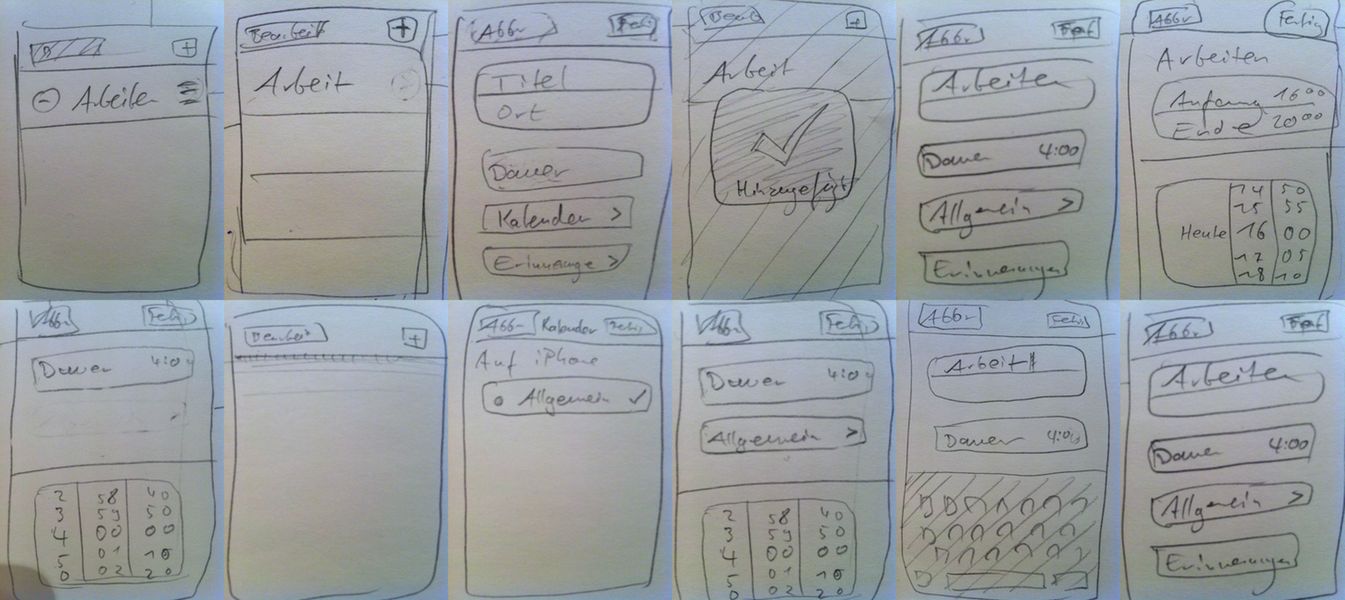
We sketched around for some time and picked certain view layouts, dismissing ugly and clumsy ones. That’s an easy start, took us 15 minutes.
I think paper prototypes by themselves are seldomly fun to interact with. You can make some sort of live chinese paper theatre ripoff and switch paper snippets when your test user interacts with the prototype.
A non-interactive option is to shoot stopmotion animations of your prototype.1 With these, you can record and then present your interface interactions as replays. That’s not as revealing an experience like having real live testers, of course.
If you want feedback on the interaction, you should probably prefer interactive prototypes to replays. No-brainer, isn’t it? Here’s my minimal approach to that.

Since I always found it somewhat tedious to cut out interface elements as paper snippets and shuffle them around when the test user interacts with the prototype, I opted for a minimal technology-based solution.
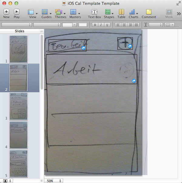
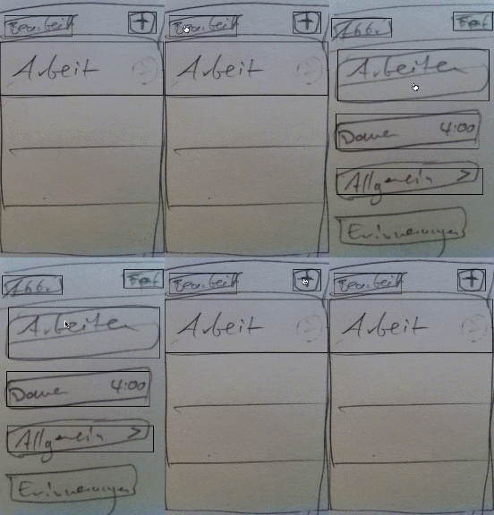
Because paper alone didn’t cut it, we took pictures of every view with our iPhones and determined which views were connected to one another in a little flow chart. Marko then assembled a Keynote presentation with the appropriate dimensions and included the pictures I took.

Keynote (and PowerPoint, for that matter) provide ways to create hyperlink boxes on the slides. This way we added interactivity to the Keynote prototype. Still, there’s a small caveat: when you miss the hit targets in Keynote presentations, the presentation simply advances to the next slide. There’s no way to prevent this easily, though.
You know what? We didn’t see the opportunity to create a cool prototyping app like the folks at WOOMOO did: they’ve released this truly useful app called POP – Prototyping on Paper.
Today I wholeheartedly recommend you use POP and ditch Keynote to create interactive paper-based prototypes. It does what you want: compose shots of your paper prototype into an interactive picture prototype. You can even share it with others. I like it.
Phase 2: JavaScript Prototype

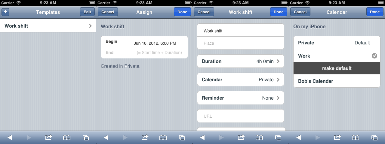
In the last stage of prototyping, I went and created a jQuery/jQuery Mobile webapp. It’s now hosted on GitHub. Try it for yourself!
Albeit it was a little more time consuming to get there than I expected, this prototype revealed a nice interface detail: I found a way to get rid of all settings for Calendar Paste, which would consist of selecting a default calendar for new event templates.
Now the app asks the user whether his custom calendar selection should be stored as the default. That’s the only preferences entry I could think of anyway, so getting rid of that meant I wouldn’t need to implement a “Settings” view at all. Getting rid of that is always nice.2
So getting an interactive prototype ready to roll took some time. But during the process I was able to think differently about the app’s design. Paper alone didn’t induce such ideas. Maybe they’d have come if I only spent more time with them, who knows.
-
Bonus: I even ran the JavaScript prototype on my iPhone. It wasn’t very responsive I have to admit, but I nevertheless was able to test a few design assumptions on the device itself and took notes.
-
Bonus bonus: this was the moment I wanted to reach out to other people and get their opinion real hard. (I didn’t. Chicken.) This already is kind of a Minimum Viable Product (MVP), and it’s more than just a video presentation3, so why not get some real feedback from the community?
In this stage the prototype is still a user interface test only. For a “real” MVP it’d be nice to have it do something, like, say, create events into the real Calendar thing. That’s not allowed on iOS, though.
-
Here’s another bonus tip oncerning web apps on the iPhone: just like the folks of Forecast.io said, you shouldn’t imitate the native look and feel of an iPhone when you create web apps. (I did and was ennerved by the delays.) There are certain assumptions concerning the looks and behavior of native elements which you better not try to replicate (because you will fail). Instead of leaving your users in Uncanny Valley, just do something different with your interface altogether and you’ll be fine.
Conclusion
Prototyping helped me get a feeling for the actual app.
I’m not very good at just juggling thoughts in my head. Taking notes, sketching stuff, making Mind Maps—all that facilitates the process of thinking for me. When I created these prototypes, I also created opportunities for rapid, visual and tactile feedback and learned stuff quickly by shortening the delay between user interface iterations.
Having Storyboards and the like in Xcode’s Interface Builder might do the trick for you, too, if you setup basic navigation and sketch a first half-functional UI draft. When it comes to visually arranging the components by clicking it might even be a lot more fun than dealing with jQuery Mobile in code.
As Florian Kugler pointed out, ditching Interface Builder altogether might be worth it. I didn’t touch it once during development of Calendar Paste.4 But that’s another chapter; Interface Builder might be just what you need to get you started and prototype your app. Just don’t rule out the choice to create the final app in pure code later on just because you had a first interface draft prepared in Xcode’s Interface Builder already.
Next time I’m going to use POP. Since it’s way more comfortable to prepare and use than Keynote presentations, it may even be sufficiently interactive so I won’t need a closer-to-the-real-thing JavaScript prototype.
See the Calendar Paste development series overview for more posts like this one.
-
Software like iStopMotion (no affiliate) seems to work for that stuff. Currently on sale on MacHeist until 2013-04-26. ↩
-
Since this is a webapp, I can hotlink to the calendar picker view so you can see for yourself how I imagined it would behave. I like that I’m able to navigating the web app with anchor links. Reminds me of custom URL Schemes on iOS. Makes me think … ↩
-
Did you know Dropbox started out as a video-MVP? ↩
-
Spoiler alert: That’s not entirely true. I used a table view in Interface Builder to see how it’d work. Hey, some of Apple’s example codes use
.nibfiles, so what else was I supposed to do? ↩