Browser-Like Navigation in The Archive
This weekend, I released an update to the note-taking app I’m working on for a while called The Archive. This update is pretty big for people not getting updates from the opt-in “Cutting Edge” update channel, because all of a sudden the app allows you to navigate back in time.
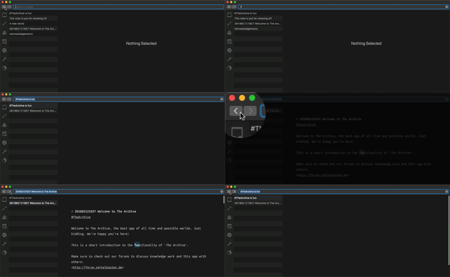
The navigation stack (what you’d call browser history available from the navigation buttons in your browser) behaves like this:
- Select a note from the search result list, and it gets added to the navigation stack.
- Type into the Omnibar to search. A snaptshot for the history will be created once you change the selection.
Restoration of a historic point in time means the same note you visited is visible again, and the search results are restored completely. Including stuff you might have deleted in the meantime. You could use this to restore notes, if you wanted.
Check out The Archive’s free 60 day trial. Experience this yourself.

It took a while to experiment with the rules for this. What counts as a “historic event” that should be recorded?
If you type a long search term into the app’s Omnibar, it wouldn’t make much sense to add each keystroke to the history. So that’s not a good candidate for a rule.
If the app remembered changes to search results instead of your keystrokes, the history would be less noisy and travelling back in time would be more meaningful, granted. It’s still too weird, though. Let me illustrate what I mean here: if you type to search for Zettelkasten, it’s very likely that the set of search results will stay the same after you typed Zettelk. So the subsequent searches for Zettelk, Zettelka, Zettelkas, Zettelkast, Zettelkaste, and Zettelkasten would not be stored in the history because the search results are the same for all of these (partial) search terms. But is the set of search results the most meaningful thing of the app? Is it what you want to go back to?
Eventually, we settled on getting back to changes of note selection.
If you select a note from the search results, it’s added to the history and you can go back to it. That feels pretty natural already, much like clicking on a link in a web browser results in a different page being shown, so you hit the back button to get to the previous page. We don’t tend to think about this and take it for granted; it’s a clear case.
But what about searches? The Archive sports a feature where it automatically shows the best match of your search result in the editor. Whenevery you follow a link from note A to note B, this is essentially what’s happening under the hood: note B’s title is put into the search, and B is the best match for its title, so it is displayed immediately. This interaction, following links, had to result in putting the note on the history stack as well.
Through this, we initially got adding the best match for a search when the user types for free. And it’s not weird at all. Often the best fit, displayed by the app, end up being what the user interacts with. And by “interact” I don’t mean editing the contents; looking at it is enough oftentimes. You want to get back to the note you just read a minute ago. So we kept this.
Navigating your notes in The Archive is feeling more and more natural with every update. I really like to work inside the app as much as I like working on the app. I take this as a good sign, and I sure hope the app brings delight to the work of others, too!
I cannot wait to see the next big features being implemented and talk to users about them. I really can’t. It’s a pity I’m the bottleneck here, darnit :)
Check out The Archive if you haven’t already and tell me what you think of the latest additions!