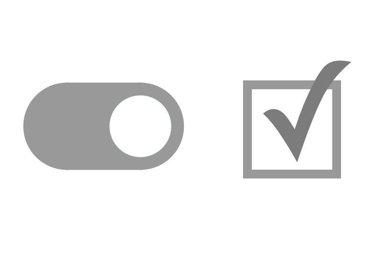
Switch VS Checkbox in User Interface Design

On the Mac, toggle or switch widgets aren’t very common, yet. On iOS, you don’t see lots of checkboxes. This article on UX Movement points out that switches are for immediate actions while changes to checkboxes require a submit button to be pressed.
Now I think about preference panes in Mac apps. They usually perform changes to NSUserDefaults immediately. But using switches on a Mac still feels wrong. Maybe just because I’m not used to it, but still.
macOS’s Notification Center has a switch to toggle “Do not Disturb”. It works, but I don’t use it a lot, so there’s not much opportunity to get accustomed to it.