Show Light Text on Dark Recessed NSButton with an Image
This is how I made dark NSButton with the NSButton.BezelStyle.recessed display legible light text on dark background with macOS Mojave an up.
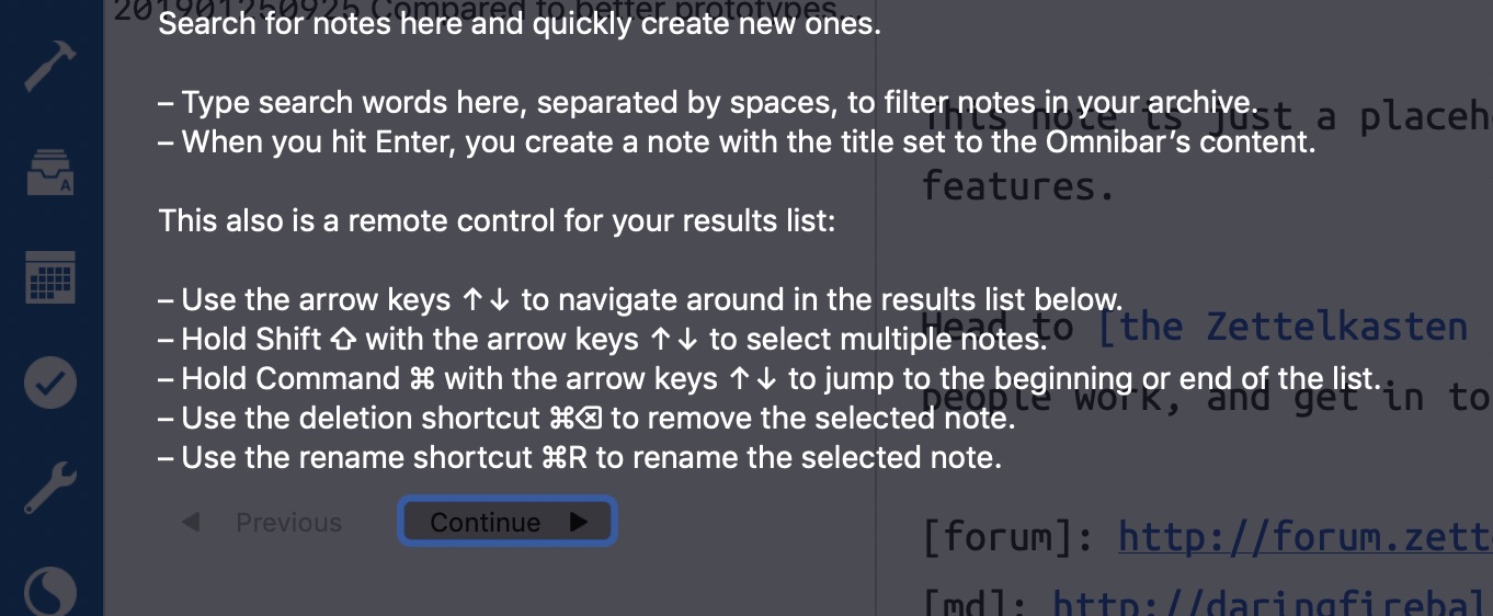
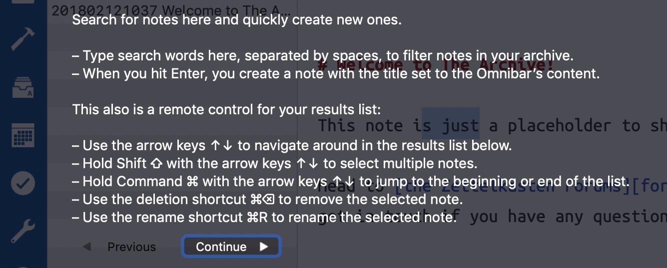
Recently, a user of The Archive pointed out that the in-app guide doesn’t display properly with a light system appearance. In dark mode, you wouldn’t notice the problem, but in light mode, the button colors rendered them illegible. Only when you press a button does its text light up properly for its background color. Have a look:

Something must’ve changed over the last 12 to 18 months or so, because I am very positive that the colors were legible when I introduced the feature – the screenshots and video from the GitHub project README clearly show so.
Unlike UIButton, NSButton doesn’t display its text with a label. So you cannot just set titleLabel.color to a meaningful, preferable “semantic” system color. You have to customize attributedTitle, which is an NSAttributedString. Changing the color means setting .foregroundColor to a different value.

Generally, I despise attributed string API’s in macOS since I began fiddling with NSTextViews. That’s because the default setting there is not an empty attribute collection but includes a slew of settings, including a custom font and font size. You cannot just say “I want to use a default text view but change the font family” without reading the previous attributes, including the font size. It’s not that much of a problem in practice, but I would rather do it in a different way.
Even though I found that simply replacing the default attributedTitle completely didn’t look odd at all, I don’t want to accidentally break macOS version dependent attribute settings, so here, too, we’ll apply the foreground color carefully as a patch:
open class DarkButton: NSButton {
    override open var title: String {
        didSet {
            updateTitleColor()
        }
    }

    private func updateTitleColor() {
        var attributes = self.attributedTitle.attributes(
            at: 0,
            longestEffectiveRange: nil,
            in: NSRange(location: 0, length: self.attributedTitle.length))
        attributes[.foregroundColor] = isEnabled ? NSColor.white : NSColor.black

        self.attributedTitle = NSAttributedString(
            string: self.title,
            attributes: attributes)
    }

    // ...
}
The image is a template image and doesn’t color itself properly either. I didn’t find a conclusive way to affect a template image’s color: it appears that NSButtonCell is responsible for this and theoretically comes with customization options in its setCellAttribute(_ parameter: NSCell.Attribute, to value: Int) method. But fiddling around with that didn’t yield the results I expected. A push button has two states, and its cell can be customized to draw differently in each state. I don’t want to override the cell or fiddle around with its properties for highlighted/selected images.
Instead, I make a colored copy of the template image and found this to work quite nicely.
extension NSImage {
    fileprivate func tintedNonTemplate(color: NSColor) -> NSImage {
        let image = self.copy() as! NSImage
        image.lockFocus()

        color.set()

        let imageRect = NSRect(origin: NSZeroPoint, size: image.size)
        imageRect.fill(using: .sourceAtop)

        image.unlockFocus()

        // To distinguish the original vector template from the tinted variant,
        // make the copy a non-template.
        image.isTemplate = false

        return image
    }
}
To adjust the color later when the isEnabled state changes, I cache the original template, though:
class DarkButton: NSButton {
    // ...

    open override var image: NSImage? {
        didSet {
            guard let image = self.image else { return }
            guard image.isTemplate else { return }
            self.templateImage = image
        }
    }

    var templateImage: NSImage? {
        didSet {
            updateImageFromTemplate()
        }
    }

    override open var isEnabled: Bool {
        didSet {
            updateImageFromTemplate()
        }
    }

    private func updateImageFromTemplate() {
        guard let templateImage = self.templateImage else { return }
        self.image = templateImage.tintedNonTemplate(color: self.isEnabled ? .white : .black)
    }
}
This isn’t meant to be a drop-in base class replacement for all of your buttons in all of your apps. This does introduce some weird behavior, like accepting a black template image but rendering a white non-template image instead. It’s a hack. It violates the Liskov Substitution Principle. I know all that. But it gets the job done for this one interface element.
The updated source of the overlay library is on Github: