Adapt Unidirectional Flow Virtues to Your Plain SwiftUI App
You can adapt principles of unidirectional flow without having to adopt a whole framework like ReSwift or Composable Architecture or Immutable Data.
You can adapt principles of unidirectional flow without having to adopt a whole framework like ReSwift or Composable Architecture or Immutable Data.
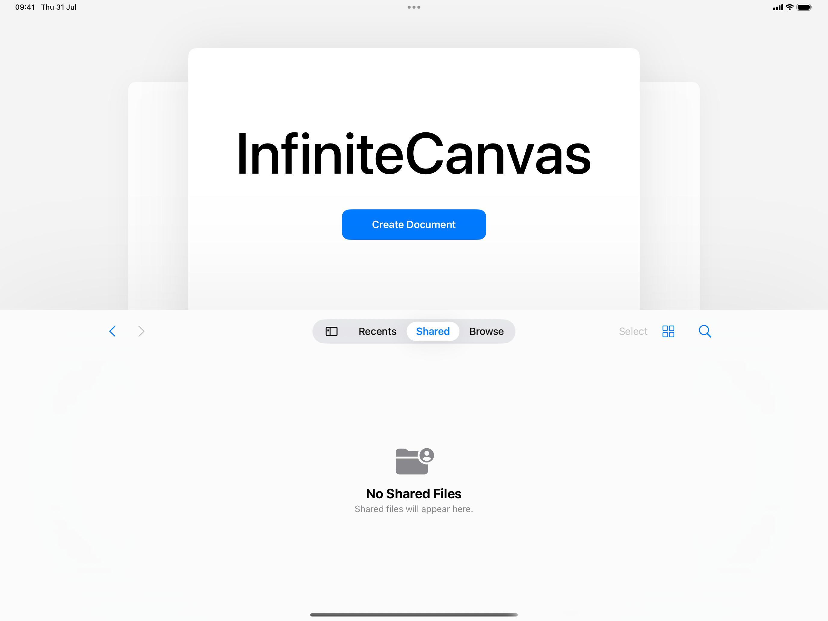
For InfiniteCanvas, I’ve started the app as a single-window application on Mac. As it got useful, I switched it to become a document-based app. SwiftUI has some facilities for this. This is how little you need to get started: And that produces:
I want to start a new series where I show snapshots of my Zettelkasten work. Because it’s tremendously useful for programmers – but at the same time it’s hard to grasp what I actually do. The mechanics are very simple. Trivial even, especially for programmers who have their favorite editors and writing tools.
Professor John Gallaugher of Boston College has a free course on making apps with SwiftUI, to be updated in 2025: https://www.youtube.com/playlist?list=PL9VJ9OpT-IPSM6dFSwQCIl409gNBsqKTe On his website, there’s a previous iteration of the course using UIKit (which I believe is still a very valuable framework to learn in 2025, given how often you need to implement or fix things in SwiftUI!)
I find myself looking at an NSView subclass that actually doesn’t do much. It’s an opaque container for a text field that sets a label text. “Opaque” inasmuch as its outward appearance is being view, hiding the actual component’s complexity inside. This is just one example of an oft-repeated pattern: delegate to sub-views, using view composition instead of inheritance. This reduces the public API quite a bit by virtue of its opaque nature.
If your macOS app is a SwiftUI app with custom button styles that targets macOS 15+, you don’t need my click-through fix anymore. Reported via Feedback Assistant on 2024-04-11, FB13720950 is now closed because macOS 15 Beta 2 solved the issue.
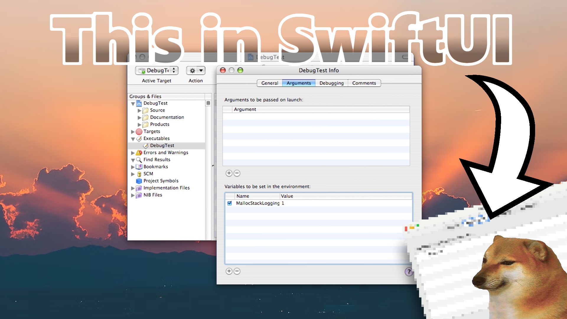
Ever wanted to recreate a beautiful Mac OS X Aqua app in SwiftUI? Technical Note TN2124 contains cool debug information, and a screenshot of the DebugTest Info app. Here’s a live-coding session (24mins) to recreate the DebugTest Info app:
On macOS, there’s 1 active window that receives your key input. Then there’s all the other windows, which are potentially invisible or obstructed by other windows. These inactive windows can be brought to the front and made active with a click. Then you can interact with these windows like normal. With inactive but visible windows, you cannot select items from lists, for example. The UI reflects this with a greyed-out or dimmed representation. You need to click once to activate the window (on the surface of the window, so to speak), then another time to interact with the control.
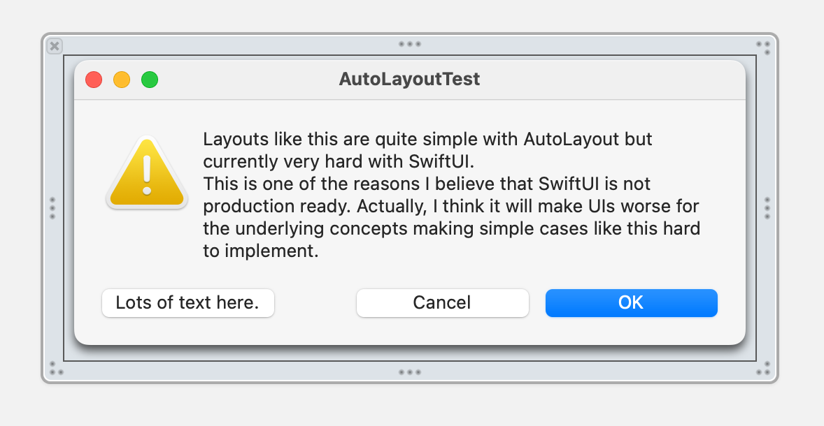
On Mastodon, we had a discussion about whether you are more or less productive with SwiftUI or UIKit/AppKit. Der Teilweise (@teilweise@layer8.space) chimed in with an actual, measurable benchmark: a flexible-width window, with reflowing text, and equal-size buttons. Doable in 10 minutes. Can SwiftUI beat this?
Chris Eidhof and team launched the SwiftUI Field Guide website today.
I noticed that Chris fiddled with JavaScript animations and layout representations to mimick SwiftUI as close as possible and wondered what kind of e-book could be upcoming, but it turns out it’s a website!
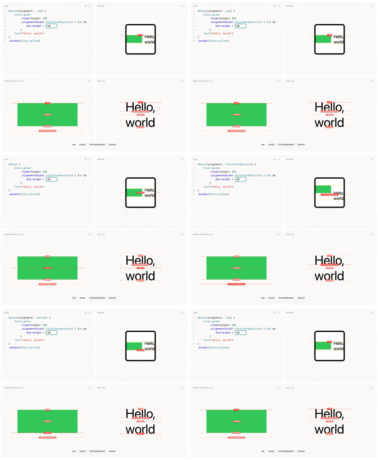
As a resource to learn, the approximations are more than good enough. They are excellent and by virtue of being interactive, they are also much better to get a feeling for everything than the SwiftUI documentation’s images can ever be. There’s only so much an API documentation can teach you before you need to observe how it really behaves.
Since it’s in a browser, the preview is of course even faster than Xcode Previews would be, and without the crashes. (Oh, the crashes …)
I wish the SwiftUI Field Guide had been available a year ago when I had to figure out so many things through trial and error!
Some sections apparently aren’t finished yet (they’re greyed-out), but you can learn a lot about the reverse-engineered layout system’s inner workings.
Marin’s Swift Heroes 2023 talk was just uploaded yesterday. It’s called “A 100% SwiftUI App”, and I believe you should watch it, because it’s not actually about what it says on the tin!
Marin’s a charismatic presenter and excellent storyteller. (He also later admits it’s his 65th tech talk, wow!)
There are a couple of gems:
One is the use of the (ficticious) AppKit property leftShiftPressedInCombinationWithTouchBarWhereAvailableRepresentsMouseEvent = 6 to illustrate that over the past 35 years, AppKit has become quite weird, actually.
Another is Marin’s summary of the whole situation right afterward:
Time makes perfect;
but also adds a hundred properties to every class.
– Marin Todorov, 2023
So I’ll spoil one more detail: “A 100% SwiftUI App” is not actually a hard sell to do all of your apps with 100% SwiftUI. Quite the opposite.
I won’t spoil why, though.
Remember when I wrote about MVVM and eventually in 2015 produced this: I learned that the “view model” in the architectural style of MVVM is a “model of the view” instead of a “model for the view”. Let me explain the difference and the benefits of being able to chose between both.
Say you have a view component. You can control which subcomponents it displays for maximum reuse. One day, you end up configuring the available effects, or actions, of the view component. Let’s say it’s something like this, a made-up example: The delete case with its associated value sticks out a bit.
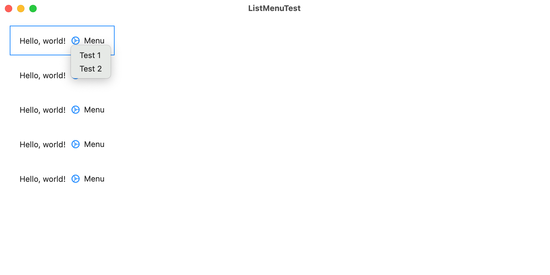
With Xcode 14.3.1 on macOS 13 (Ventura), I found that you cannot put SwiftUI.Menus inside Lists without breaking the key event loop – iff you also set the menu button’s .buttonStyle(.plain)! Once that button style is used, menu item interactions will make the app
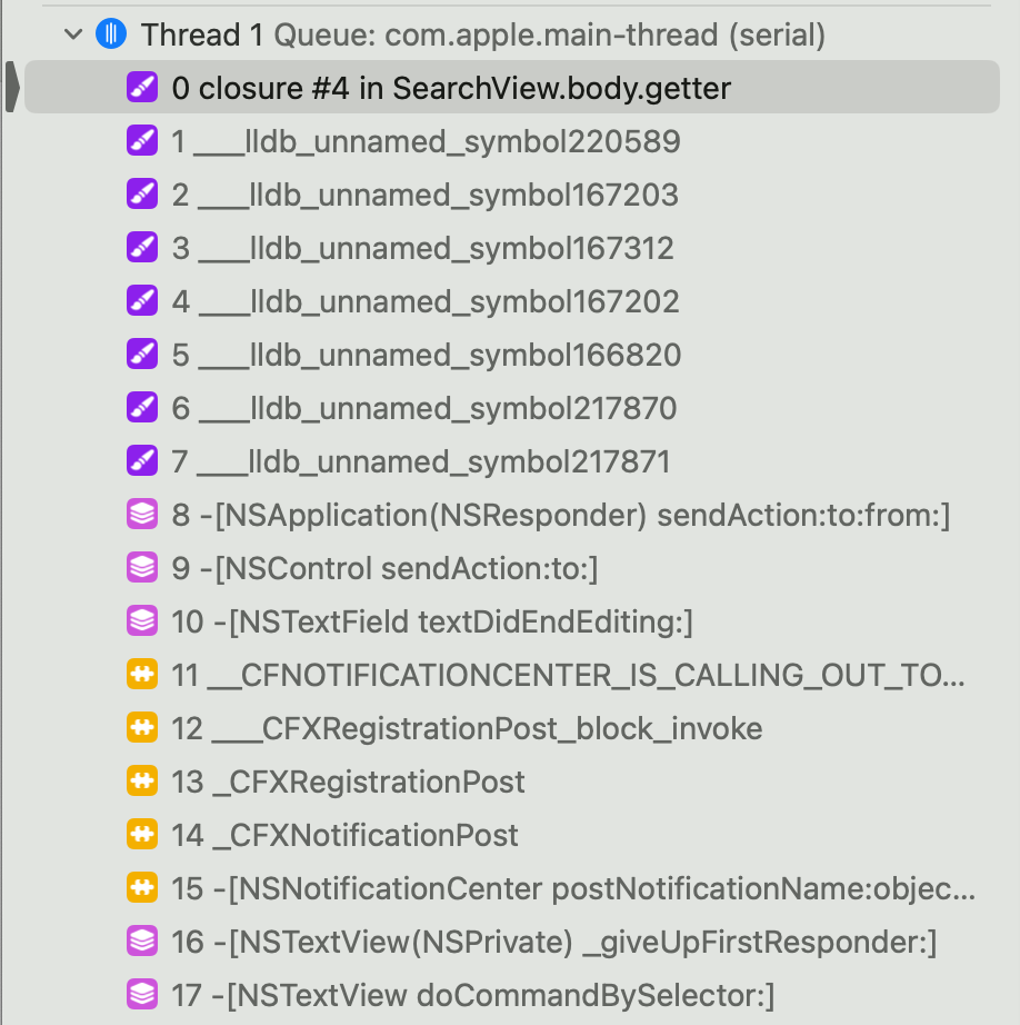
I wanted to know how a SwiftUI TextField gets to know its onSubmit handler to wire my own NSViewRepresentable to it (would be the same for a UIViewRepresentable). There’s no key for that block in the EnvironmentValues structure that you get from the “context”, though.
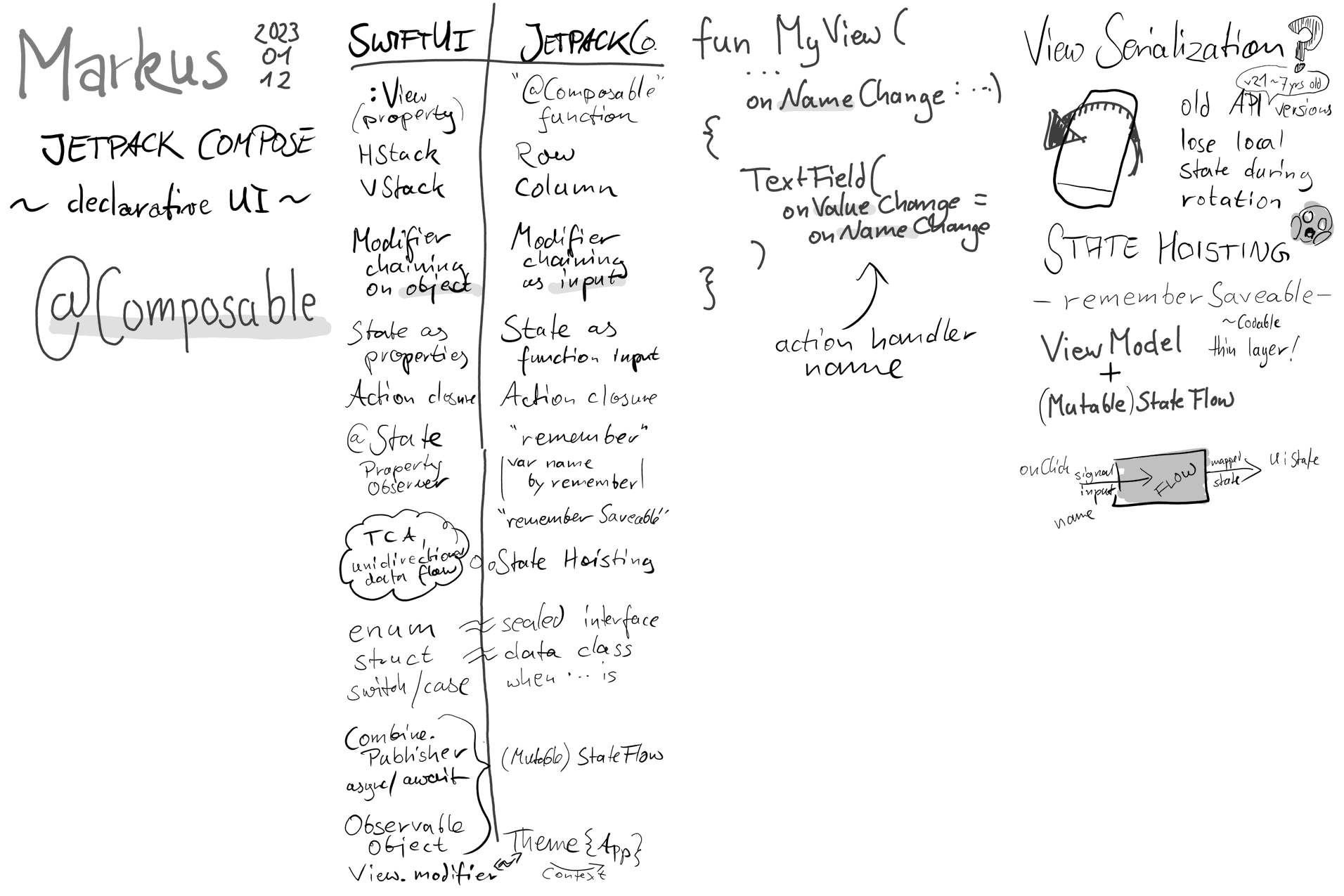
Markus Müller (@m_mlr) recently did a presentation at CocoaHeads Leipzig about Jetpack Compose. – Thanks for the inspiring presentation, Markus! I learned a lot. Update 2023-01-24: Check out the sample project on GitHub!
How long does it take to become a true SwiftUI master? How far am I on my own way to mastery? 🤔 Let’s quantify and have a wild guess! I start this introspective journey by looking at another topic I feel like I could become quite the expert, even though I am painfully aware of how much I still don’t know – Text Kit.
In SwiftUI, @EnvironmentObject is used to loosely couple any ObservableObject without directly passing it down the view hierarchy, e.g. via parameter injection. Unlike Singletons and global variables, Environment Objects are local to view hierarchies: different branches in the hierarchy can maintain different object references.
SwiftUI very likely is the future of app development. But it cannot, on its own replace UIKit or AppKit. Not yet, maybe not next year, either. Eventually you will have to drop down a level to implement a custom view, custom navigation, animation, window, or what have you. So for the time being, the two worlds of UIKit and SwiftUI co-exist and complement each other.
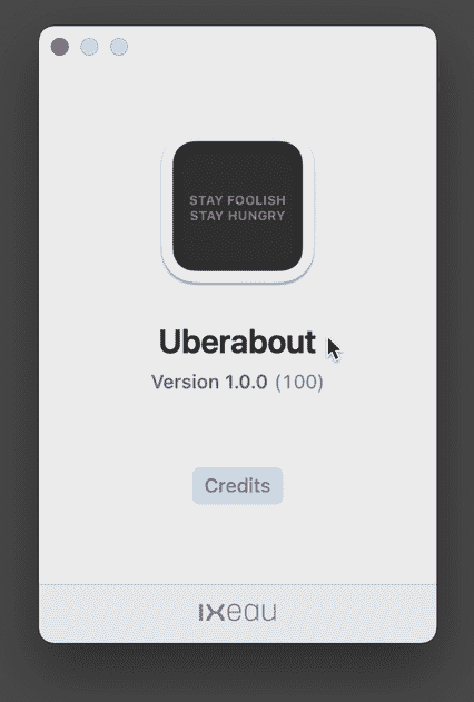
Martin Lexow created a sexier alternative to the default AppKit “About” window called Uberabout
You know, these things:
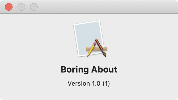
The info available to be displayed there is:
Now Martin came up with a drop-in replacement for the same info but with less ugliness:

Check out the GIF in the project’s readme to see its 3D transition effects in action!
Sadly it’s only for macOS 11.0+, so for projects pre-Big Sur, you have bad luck. But it’s written with SwiftUI, so you may still learn one thing or another, or adapt the code to your project if you want!